Smalley Lawn Tennis Club Logo
Redesigned the Smalley Lawn Tennis Club logo as part of their fresh rebrand under new ownership.
Year
2025
Client
Smalley Lawn Tennis Club

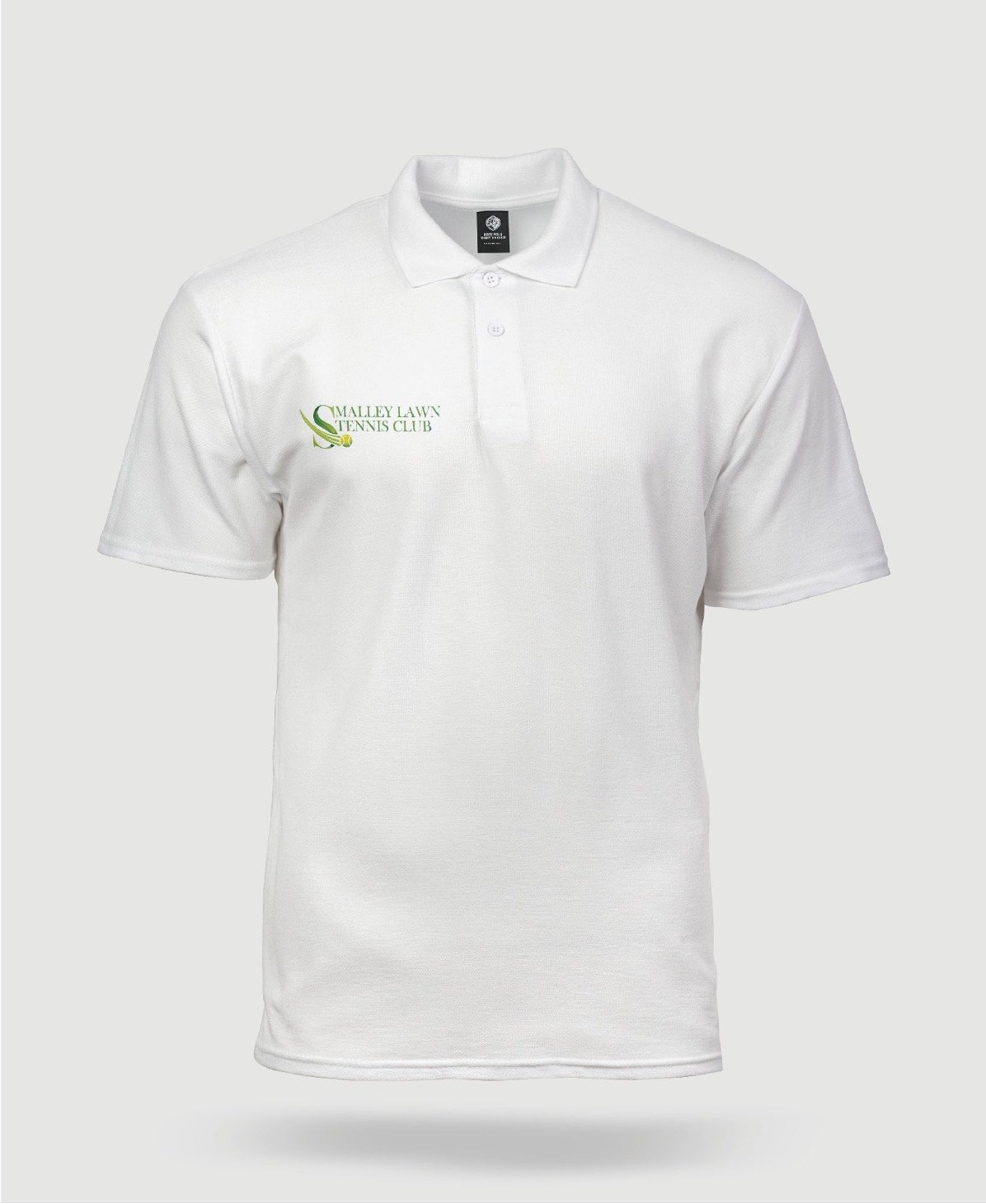
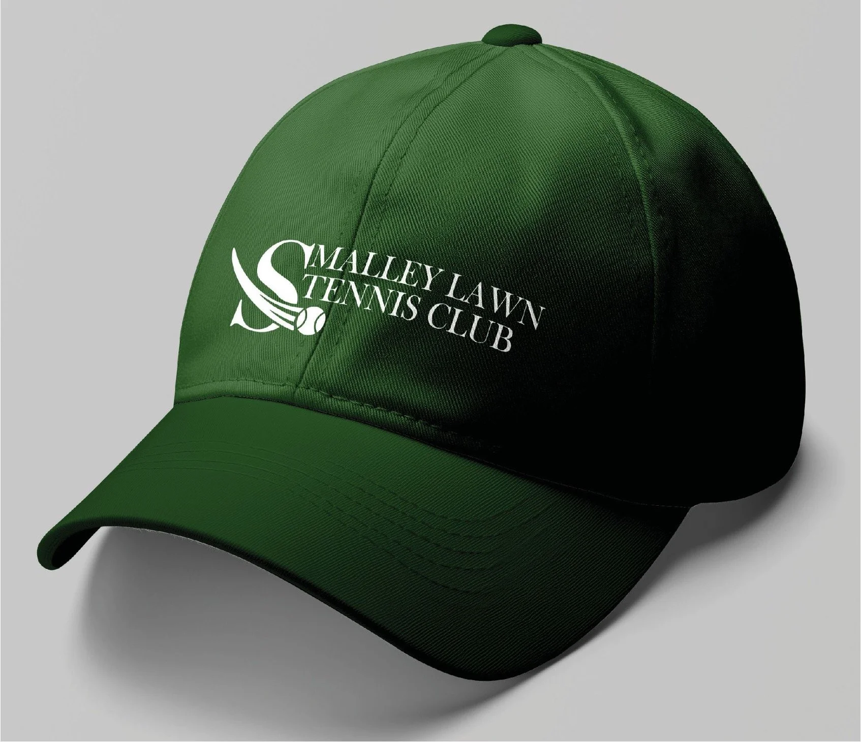
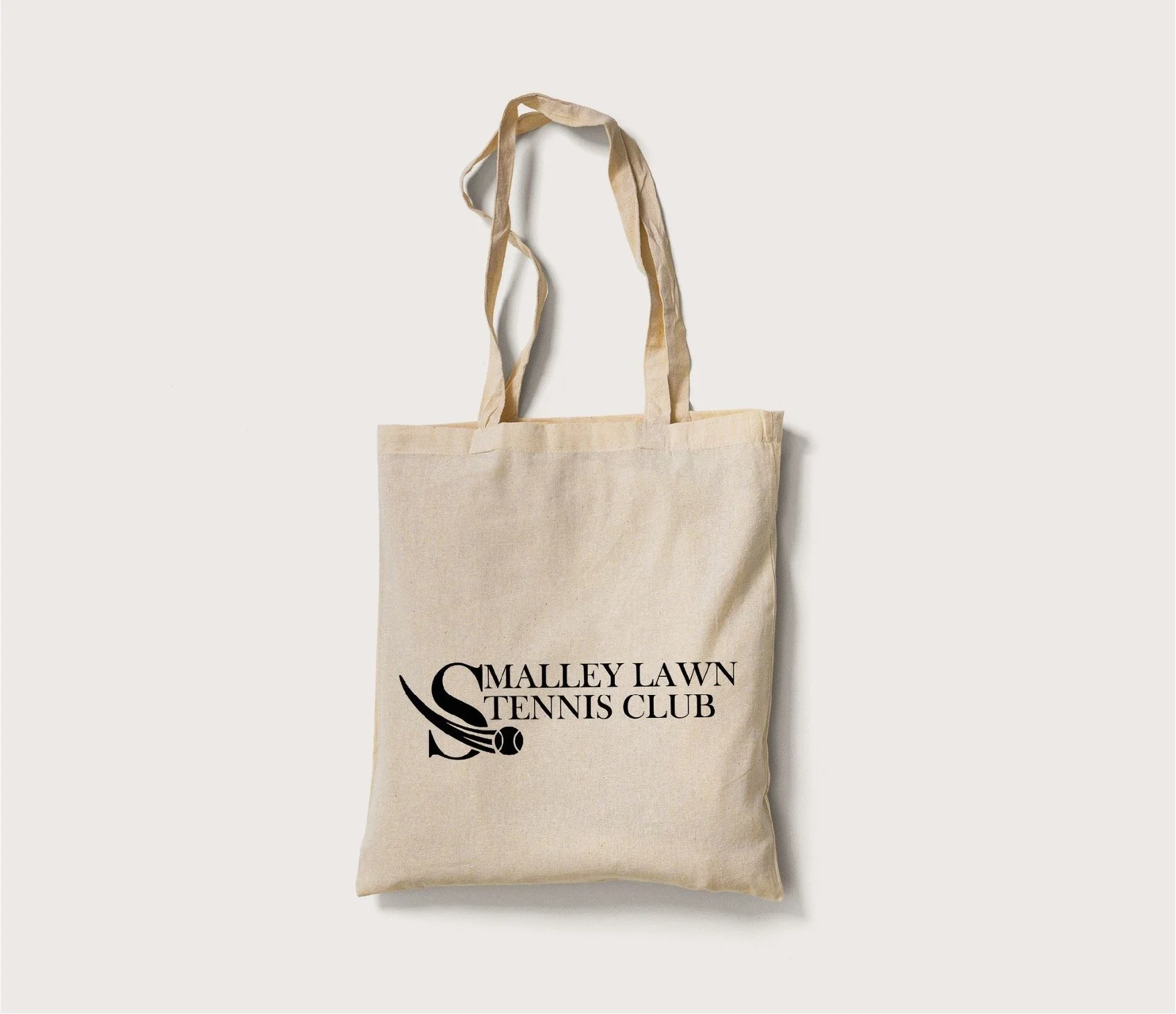
The logo was designed with flexibility in mind – it can be used in full for formal or branded materials, or as a shortened version featuring just the distinctive ‘S’ element. The standalone ‘S’, with its integrated tennis ball, works perfectly as a modern, recognisable symbol for social media icons, merchandise, and signage while still staying true to the club’s identity.

I redesigned the logo for Smalley Lawn Tennis Club as part of their rebrand following a change in ownership. The new design pays homage to the club’s existing identity, keeping it familiar and respectful for long-standing members while introducing a modern, refreshed look. I focused on maintaining the club’s sense of community by evolving—rather than replacing—the original concept. The design centres around the letter 'S' from 'Smalley', incorporating a dynamic tennis ball sweeping through it to symbolise motion, energy, and the sport at the heart of the club.